
Are a person’s design choices influenced by geography? David Brailsford, Altro’s new product introduction manager, looks at surfaces for healthcare environments around the world and explores the influence that climate and light, as well as cultural and social conventions, may have on the choices we make
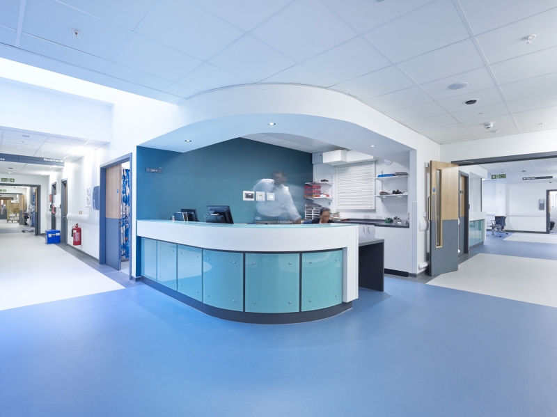
> The healthcare sector has traditionally posed challenges for designers and architects when it comes to specifying materials that can be used on floors and walls
The healthcare sector has traditionally posed challenges for designers and architects when it comes to specifying materials that can be used on floors and walls.
Products and finishes have to meet stringent criteria, including enhanced safety requirements, hygiene of the highest standards, and legislative obligations.
Thankfully, there are now a huge range of options that satisfy these requirements, while offering far more flexibility when it comes to aesthetics.
Unsurprisingly, the advent of greater design choice – more-extensive colour palettes, designs and finishes – brings about a melting pot of creativity and style, even in a sector such as healthcare where function must remain the highest of priorities.
Getting the colour palette right is a hugely important part of any new product introduction, made even more complex if those products are to be used in different countries across the world.
There is no doubt that aesthetics and design have a huge part to play in creating environments that are calming, healing and therapeutic
The science of colour
Colour temperature, in its most simplified definition, is a method of describing the colour characteristics of light, and is measured in degrees Kelvin.
Designers are well versed in considering colour temperature when it comes in interior lighting, using warm or cool lighting to create mood or ambience as well as providing artificial light of the correct colour temperature helping those with visual impairment. We see this played out on a much-bigger stage with nature’s variations in colour temperature around the world.
Essentially, colours are not fixed. In reality, an object’s appearance results from the way it reflects the particular light that is falling on it. For example, an apple we see as red appears red under white light as it reflects light in the red portion of the wavelength. If a filter is used to remove red from the light source, the apple reflects far less light and could appear black.
We see the same principle (though a far-less-extreme version) played out in the way colours look in different countries.
As you move north away from the equator, natural light becomes bluer, and has proportionally less red light. As a result, ‘warm’ colours that look lovely and vibrant nearer the equator look less intense in the northern hemisphere, and the further north you go the more evident the change.
‘Cool’ blues and greys, however, are complimented by the light balance in the northern hemisphere and as a result look more desirable.
This goes some way, perhaps, to explain variation in trends we see in healthcare across the world.
In the US, warm, beige tones are particularly popular for flooring; we may see richer, warmer hues in Mediterranean countries; in Scandinavia, white, cool blues, light greys and dark greys make for stylish healthcare environments; while in the Middle East paler pastels are proving a hit. These are, of course, generalisations, with cultural influences playing a significant part in many design styles seen in all these areas.
‘Cool’ blues and greys are complimented by the light balance in the northern hemisphere and as a result look more desirable
Colour and wellbeing
There will always be a balance to strike between providing healthcare environments that meet user expectations, and those that push the boundaries of design
There is no doubt that aesthetics and design have a huge part to play in creating environments that are calming, healing and therapeutic.
The very nature of healthcare environments mean that people using them may be feeling higher-than-normal levels of anxiety or fear, not to mention pain and sickness. This is especially true with mental health design, where it’s been proved time and again that creating the right environment can make a world of difference.
There has been a very-definite move towards creating ‘home from home’, warmer healthcare environments, deliberately stepping away from the colours that may have represented a colder, clinical traditional approach.
There is also the desire for designers and architects to create the unexpected, to defy convention, to shake up traditional mainstream healthcare design, while remembering that care homes and areas catering for the needs of those with dementia require a more-traditional and familiar approach
Worldwide trends
There will always be a balance to strike between providing healthcare environments that meet user expectations, and those that push the boundaries of design.
Currently, some of the biggest projects worldwide can be found in Gulf Cooperation Council countries where the healthcare market is reportedly set to grow by 11-13% over the next five years in response to population growth and a commitment to develop world-class healthcare services.
We’ll be keeping a close eye on how that market influences healthcare design around the world, and maybe shapes the palettes of the future.
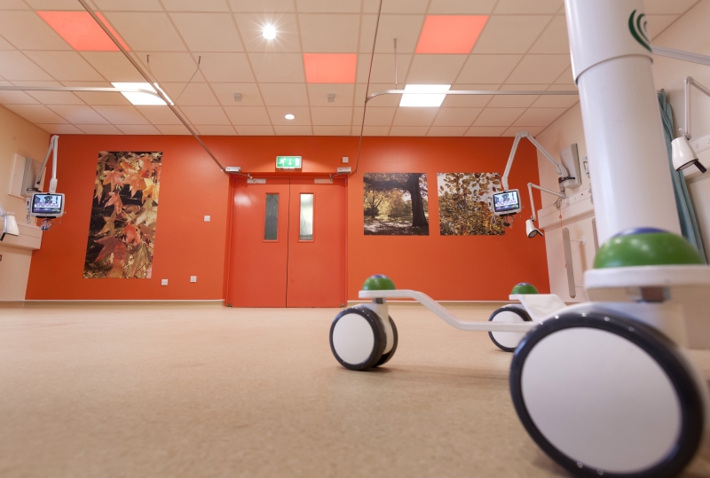
There has been a push towards the use of warmer colours