
There are a number of design principles to consider when creating spaces that properly support people living with dementia.
Use of colour and the contrast between colours is a great way of helping people with visual impairments and dementia to identify key features and rooms
These include the layout of a space and the choice of interior decoration – in particular, the use of colour.
“In health and social care environments, colour can be used to create spaces that are not only more comfortable for residents, patients and visitors with dementia; but are safer too,” explains Kayleigh-Ann Whybrow, a senior technical colour consultant at Johnstone’s Trade.
The company has worked with the Dementia Services Development Centre at the University of Stirling to develop a series of paint ranges that help environments to meet Disability Discrimination Act requirements, and are specifically tailored for dementia care settings.
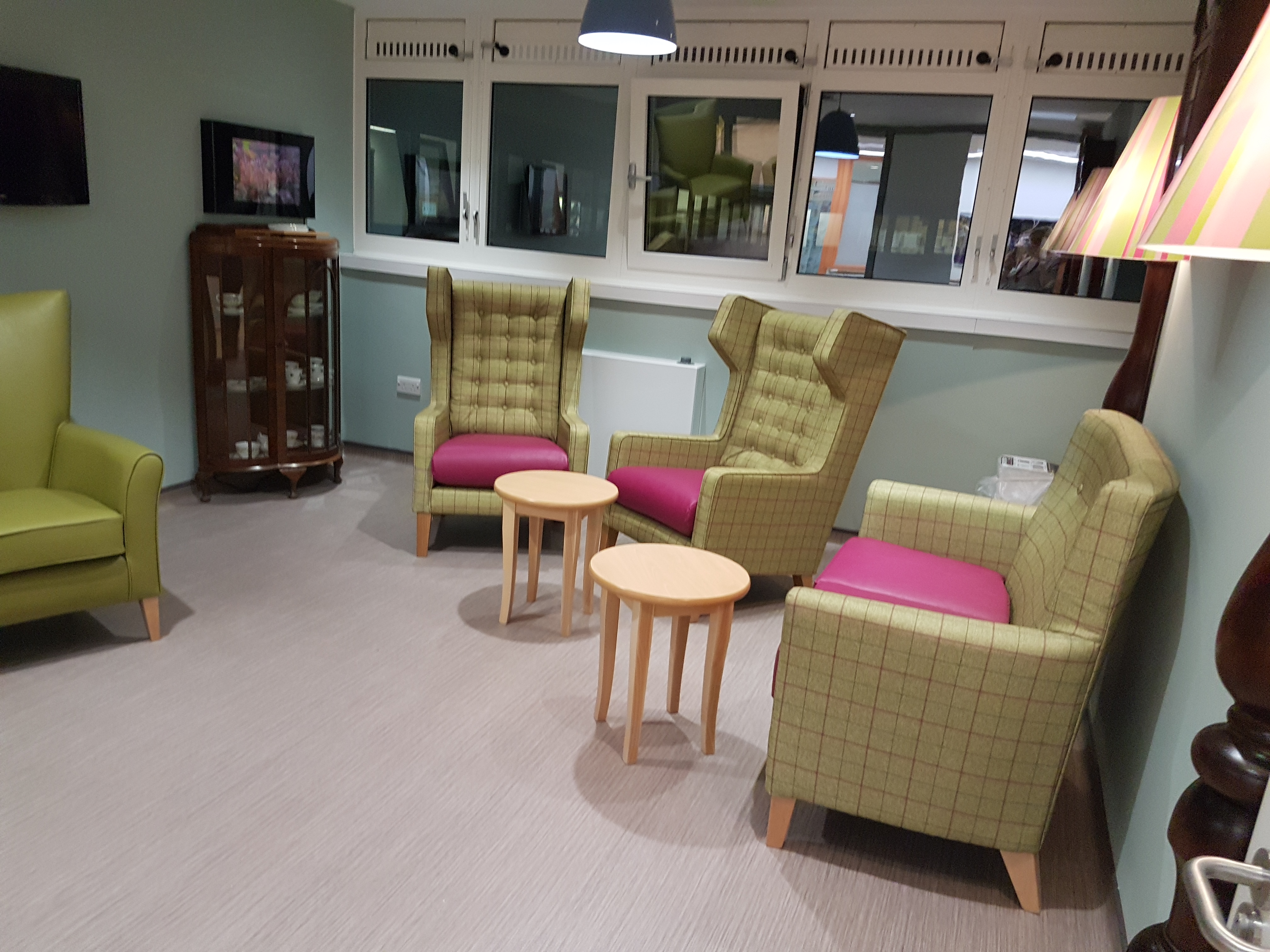
A showcase at the university included lilac or pale-green walls within living and communal areas, contrasted with pristine white trim and oak doors. All bathroom doors were finished in bright yellow, and the bathrooms themselves were painted in contrasting shades of blue.
“The use of colour and the contrast between colours is a great way of helping people with visual impairments and dementia to identify key features and rooms,” said Whybrow.
With particular types of dementia, for example semantic dementia, people may have to rely on their conceptual knowledge to identify individual items. Thus, using size and orientation in combination with colour can help them to recognise and use spaces safely.
In contrast
Doorways and windows that contrast in colour with surrounding walls can make it easier to identify different rooms.
When selecting colours for dementia-friendly environments, it’s important to bear in mind that, due to natural thickening of the lens of the eye with age, older people may experience colours as ‘washed out’
And consistency and uniformity, such as ensuring all toilet doors are the same colour, can also support wayfinding.
Conversely, colours can also be used to help mask things that could be unsafe.
For instance, by matching the colours of outside doors and entrances to kitchens with surrounding walls and doors, it is possible to reduce the chance that people with dementia will be able to identify them and lessen their interest in these potentially-dangerous areas.
But Whybrow warns: “When creating a contrasting colour scheme, it is not simply enough to just choose colours that appear different, for example a red and green. This is because the colours may actually have a similar light reflectance value (LRV), which can still make them very difficult for those with limited sight to differentiate.
“To ensure the contrast is easy to see, colours should have LRVs with at least 30 points difference. Information on LRVs is provided directly by paint manufacturers to help those designing colour schemes to ensure they are choosing hues that work effectively together.”
Make colour count
A range of colours can be used to create interesting spaces that support people living with dementia. However, it is the combination of hue, saturation and tone that is key to creating a perfect colour scheme.
“Hue is most commonly referred to when people discuss colour,” said Whybrow.
“It is the attribute of a colour that allows us to classify it as a red, blue, green etc and is the true name for the word ‘colour’.
“Saturation refers to how vivid the colour is, while tone relates to how light or dark a colour is.
“When selecting colours for dementia-friendly environments, it’s important to bear in mind that, due to natural thickening of the lens of the eye with age, older people may experience colours as ‘washed out’.
“Blues, greens and purples from the cool side of the spectrum, in particular, can be harder to differentiate as these are the colour ranges which are lost first as the eye ages.
“Warmer blues, greens and purples, however, are more perceptible.”
In the right place
The aging eye also has reduced ability to perceive saturation of colour. Colour can therefore appear less vivid, for example red can appear to be pink; and a yellowing of the lens tends to make colours seem ‘muddy’.
The use of vibrant colours can help with this, while limiting the number of different colours used can also ensure a scheme does not become overwhelming.
“Calming colours should be used in bedrooms and bedded areas, with colour accents incorporated to help in spatial recognition and identification,” said Whybrow.
“Strong colours are often required to assist with identification of an area, but the main pointers should be objects and landmarks, as not every person with dementia will perceive colour in the same way.
Understanding how people living with dementia perceive and understand the spaces and features around them, it is possible to develop and incorporate colour schemes – in combination with appropriate building design and layout – that positively support their wellbeing
“Bright and energetic colours in living areas and activity spaces can encourage movement, while some colours, for example red and orange, can even promote appetite.
“Ensuring the consistent use of a colour in the same space or area used for similar activities can also act as a cue of the expected function, such as eating in dining areas.”
She added: “By understanding how people living with dementia perceive and understand the spaces and features around them, it is possible to develop and incorporate colour schemes – in combination with appropriate building design and layout – that positively support their wellbeing.”
Follow the rules:
Blue: Blues have calming and restful effect – they are thought to help lower blood pressure – so are recommended in quiet rooms and bedrooms. Cool blue colours can also make rooms appear larger and several degrees cooler
Green: Greens reduce central nervous system activity and help people feel calm. They are considered to be the most restful of colours and can make rooms appear larger
Red: Red increases brainwave activity and can stimulate the production of adrenalin into the blood stream and so is recommended for high-activity areas and communal spaces where stimulation is required. Red can also make it appear smaller and can increase the perceived temperature of a room, so can be used for rooms that are cool
Orange: Another warm colour, it shares many of the same properties as red, but is also an earth-base colour and, like green, often produces associations with nature and natural environments and can thus be calming
Yellow: A highly-visible colour; it makes rooms appear larger, so is good for small rooms where you want a restful atmosphere