Hospitals are a labyrinth or corridors, waiting rooms, clinical areas, wards, theatres, offices - the list goes on.
Typically, wayfinding is left to the last minute, has little or no budget, and the scope is usually put in the hands of contractors who have no specific expertise in it
This all means that finding your way from A to B can be a trial.
Over the past few years, as we have seen an unprecedented amount of construction work carried out within the sector, the idea of using architecture and interior design to aid wayfinding has grown in popularity.
Effective wayfinding is integral to the overall patient experience and, while some trusts have introduced successful schemes, the vast majority still struggle to find a way to let patients, staff and visitors know where they are and where they need to be.
Endpoint has worked with a number of NHS and private healthcare organisations in the UK to optimise wayfinding, including Guy’s and St Thomas’ Hospitals NHS Foundation Trust; London Bridge Hospital; and East Kent University Hospitals NHS Foundation Trust.
And now its expert team has drawn up a list of important considerations for estates and facilities teams looking to adopt a more-successful approach.
Here, wayfinding design director, Alison Richings, offers her advice on the best approach to wayfinding.
1. Naming is key: Naming is a key part of the users’ success. It creates a topology and a taxonomy generating a hierarchy that can simplify the user journey. When naming - a key component of effective wayfinding - isn’t considered as part of a new brief it can compound existing problems, or in the case of a new build, set you up for potential failure right from the outset.
2. Users require clarity: That’s C-larity, with a capital ‘C’. During the strategy phase of one of our projects we witnessed elderly users entering the sexual health clinic within a hospital looking for the dental department. They were lost because they didn’t realise that the orthodontic department was the dental department. Instead they opted for the GUM clinic, the name for the sexual health department, as GUM was the nearest term to ‘teeth’. There can be no ambiguity about the terms used. Names need to be literally functional, and they need to be easy to read and to pronounce.
3. Consistency is paramount: Users require terms to be consistently applied across all touchpoints. It’s no good using the chosen names on signs if the pre-visit information, the receptionist or the medical staff use a different term.
It’s no good using the chosen names on signs if the pre-visit information, the receptionist or the medical staff use a different term
4. Staff need to be informed: Wayfinding is never limited to reception staff and porters – doctors and consultants play an important part too. During a recent project in a general hospital the client expressed concern over users finding the X-ray department. It was located in a prime position, yet users struggled to find it. In response the hospital had created larger signs at the departmental entrance, yet this didn’t seem to affect the number of users failing to find it. To understand the issues, we followed users directly to the department from the main entrance and from the outpatient areas. It was apparent that the main issues lay with the route from outpatients. What we discovered was that the consultants in outpatients were asking users to go to 'radiology', whereas the signs were labeled X-ray. No extra signage in the world could solve the inconsistencies - only communication with consultants about their role in wayfinding would cure the condition.
5. Walk the route: Walk the route, and then walk it again. Do it in reverse. Ideally, do it with different age groups, different cultural groups. There’s no better way to put yourself in a wayfinder's shoes, than to actually put yourself in their shoes.
6. Strike a balance: Find a balance between the need for ‘professional’ terminology and the needs of users for simple, easy-to-understand terms. Should the ‘geriatric’ ward become ‘elderly care'? Should 'renal’ become ‘kidneys’, and ‘phlebotomy’ become ‘blood tests’? There is a case for users feeling reassured by medical terms, that this toponymy evokes feelings of professionalism, respect, and, for users with long-term illnesses, a deeper understanding of their condition.
7. Choose Materials wisely: Hardwearing, adaptable etc are all a given, but selecting a germ-resistant material and designing the form of the product to minimise trapped dust or dirt is key. At London Bridge Hospital, Endpoint designed a magnetic system that made signs easy to remove and clean.
8. Flexibility is great – if you use it: Everyone wants to have the ability to update their signs conveniently. Most NHS trusts invest in expensive slat systems that allow for single slats to be updated. There are two main issues with this. It can be five times more expensive than using a bespoke panel. The system can become obsolete quickly, leaving you with slats that you cannot update. Simple is best. As is generic naming - reducing the need to update constantly.
9. Think early: Wayfinding is as important as lighting, decoration or interiors and should be considered earlier than you might think. You wouldn’t open a hospital without lighting the corridors properly, without an expert ensuring the correct amount of light is spread across the environment. Yet, typically, wayfinding is left to the last minute, has little or no budget, and the scope is usually put in the hands of contractors who have no specific expertise in it.
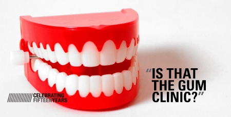
Wording is important. For example, the GUM clinic is a sexual health service, but some people assume it denotes dental care
In the case of a new-build healthcare facility, wayfinding should be considered as early as possible in the design process. For architects, bringing in a wayfinding consultant during concept design to discuss the wayfinding strategy and operational approach will ensure a seamless response. Working with the interiors team during detailed design will develop so many more possibilities for creative wayfinding ideas, if we can get in early and influence the form of the built environment and the operational needs. Some of the best collaborations have seen wayfinding schemes that cleverly make use and are embedded within the structure of the architecture itself.
10. Zoning of buildings helps: It negates the need to sign every department on every sign. But this doesn’t mean it has to be institutional. Generic numbering and the use of colour can make a huge difference to wayfinding, but soft and friendly terms might be more appropriate and make the environment feel less like a hospital.
11. Be more like a hotel: That’s not to say that hospitals are hotels or that we should undervalue cutting-edge clinical services, but the customer service levels in hotels are of a standard that all patient-facing staff should aspire to.
12. ‘Digital’ has put the individual in control: We behave differently: we anticipate, we research, we seek peer review. We have an ‘experience’ of a place or brand before we even get there. As with other industries healthcare is struggling to keep up, but recent data is encouraging. 81% of healthcare chief executives are planning to make changes in order to increase their engagement with consumers on social media. The impact on wayfinding could be profound. Imagine being able to navigate the space you are about to enter into via a digital walkthrough on your phone or spectacles, be able to check-in or chat with frequent visitors beforehand.
quotation text of a paragraph we might locate towards the right of the column
The biggest barrier to widescale adoption of innovation with digital, however, is short-termism. Innovations are perceived to be fast moving and survive for only a short time before being superceded by the 'next big thing’. Healthcare environments require high-impact, lower-cost, long-term design that is simple to maintain. We believe healthcare will adopt technology for wayfinding in small steps that use well-tested, established technology.
13. Wayfinding is not just about signs: Installing more signs is not the answer to all problems. Wayfinding is everything we see, hear, touch and smell on every part of our journey from the moment we decide to travel.
14. Patient choice is not a luxury, it’s a necessity: For too long the approach to healthcare has been about the patient as a passive part of the system. You go to hospital and ‘they’ do something to you and then you go home. Clinically, patients are being provided better choices about how they manage their own conditions. For example, it is now common for dialysis centres to be open 24 hours a day to allow patients to have their treatment when it suits them; yet the route to the centre at 3am is usually convoluted, dark and unwelcoming. The patient experience needs to be considered when managing clinical choices.
Studies have also shown that if a patient participates in their own appointment-making process, even by the small act of writing the date and time down themselves, they are more likely to turn up for the appointment. Patient choice will permeate the hospital environment and how you choose to find your way through it, either passively with fixed signs or actively through technology.
Moving on
So, what for the future? There are some great programmes currently underway – The Healthcare Research Lab at the Helen Hamlyn Centre, Royal College of Art, is investigating numerous design solutions to current and future healthcare challenges. For us, we wonder why not the creation of personal apps where the system becomes about us - the patient - managing our own condition and visit to the healthcare facility?
Patient choice will permeate the hospital environment and how you choose to find your way through it, either passively with fixed signs or actively through technology
Why can’t this app include a calendar where we can book our appointment for a time and date that is suitable for us? Where we can see that the clinic is busy and can avoid it? Where we can get updates about changes to the site or to the location of the appointment? Where we can watch an augmented reality film of the site and see where we need to go? Where it can show us the waiting times in departments, such as blood tests andXx-ray, where there is a first-come, first- serve system allowing us to pick a time where we won’t have to wait? Where it allows us to check-in, and if there is a long waiting time at the clinic, we can go and get a drink first and it will give us a five-minute warning before the doctor is ready to see us? Where we can pick our menu for lunch? Where we can upload our clinical details and discuss medical issues remotely with our doctor between appointments, if required?
Pipe dream, or simply early days?